Sign In Start Free Trial
Account

Add to playlist

Create a Playlist

Modal Close icon
You need to login to use this feature.
  • Book Overview & Buying Matplotlib 2.x By Example
  • Table Of Contents Toc
  • Feedback & Rating feedback
Matplotlib 2.x By Example

Matplotlib 2.x By Example

By : Allen Yu, Claire Chung, Aldrin Yim
close
close
Matplotlib 2.x By Example

Matplotlib 2.x By Example

By: Allen Yu, Claire Chung, Aldrin Yim

Overview of this book

Big data analytics are driving innovations in scientific research, digital marketing, policy-making and much more. Matplotlib offers simple but powerful plotting interface, versatile plot types and robust customization. Matplotlib 2.x By Example illustrates the methods and applications of various plot types through real world examples. It begins by giving readers the basic know-how on how to create and customize plots by Matplotlib. It further covers how to plot different types of economic data in the form of 2D and 3D graphs, which give insights from a deluge of data from public repositories, such as Quandl Finance. You will learn to visualize geographical data on maps and implement interactive charts. By the end of this book, you will become well versed with Matplotlib in your day-to-day work to perform advanced data visualization. This book will guide you to prepare high quality figures for manuscripts and presentations. You will learn to create intuitive info-graphics and reshaping your message crisply understandable.
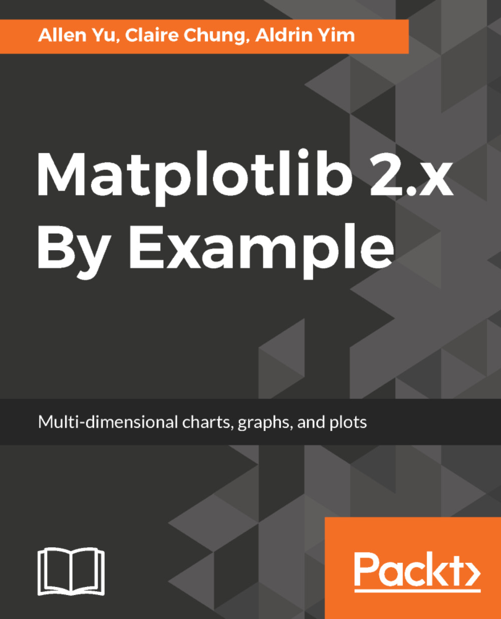
Table of Contents (15 chapters)
close
close
Title Page
Credits
About the Authors
About the Reviewer
www.PacktPub.com
Customer Feedback
Preface

Other two-dimensional multivariate plots


FacetGrid, factor plot, and pair plot may take up a lot of space when we need to visualize more variables or samples. There are two special plot types that come in handy if you want the maximize space efficiency--Heatmaps and Candlestick plots.

Heatmap in Seaborn

A heatmap is an extremely compact way to display a large amount of data. In the finance world, color-coded blocks can give investors a quick glance at which stocks are up or down. In the scientific world, heatmaps allow researchers to visualize the expression level of thousands of genes.

The seaborn.heatmap() function expects a 2D list, 2D Numpy array, or pandas DataFrame as input. If a list or array is supplied, we can supply column and row labels via xticklabels and yticklabels respectively. On the other hand, if a DataFrame is supplied, the column labels and index values will be used to label the columns and rows respectively.

To get started, we will plot an overview of the performance of...

Limited Time Offer

$10p/m for 3 months

Get online access to our library of over 7000 practical eBooks and videos, constantly updated with the latest in tech and supported with AI assistants
notes
bookmark Notes and Bookmarks search Search in title playlist Add to playlist download Download options font-size Font size

Change the font size

margin-width Margin width

Change margin width

day-mode Day/Sepia/Night Modes

Change background colour

Close icon Search
Country selected

Close icon Your notes and bookmarks

Confirmation

Modal Close icon
claim successful

Buy this book with your credits?

Modal Close icon
Are you sure you want to buy this book with one of your credits?
Close
YES, BUY

Submit Your Feedback

Modal Close icon

Create a Note

Modal Close icon
You need to login to use this feature.

Delete Bookmark

Modal Close icon
Are you sure you want to delete it?
Cancel
Yes, Delete

Delete Note

Modal Close icon
Are you sure you want to delete it?
Cancel
Yes, Delete

Edit Note

Modal Close icon
Write a note (max 255 characters)
Cancel
Update Note